

HARIBO Website Redesign
HARIBO is a German confectionery company best known worldwide for its iconic Goldbears.
Founded in Bonn in 1920 by Hans Riegel, the company’s name comes from the initials of its founder and hometown: HAns RIegel BOnn.
This project focused on redesigning HARIBO’s digital experience by combining a visual identity refresh with a more accessible, usable and commerce-oriented website.
The work covered the entire design process, from the initial audit and competitor analysis to user research, information architecture, prototyping and usability testing.
Year: 2025
Title: Haribo Website Redesign
Client: HARIBO Society
Role: UX/UI Designer & Graphic Designer
Type: Website
Tools: FigJam; Miro; Figma; Google Form; Useberry.

Project goals
The redesign was driven by four primary objectives:
01. Brand refresh
Auditing the existing logo
The first phase focused on evaluating the existing HARIBO logo and identifying opportunities for improvement.

Limited scalability
The wordmark did not perform effectively at very small sizes, particularly in applications such as the website favicon.
No standalone symbol
The identity did not include a distinctive pictogram that could be used independently from the wordmark.
White outline dependency
The white border could reduce legibility when the logo was placed on light backgrounds.
Dated visual language
Although playful and familiar, the logo could appear less contemporary in comparison with current visual identity trends.
Proposed logo

The redesigned HARIBO logo was created to modernize the brand identity while maintaining its strong connection to the company’s heritage.
The new design introduces a stylized bear inspired by HARIBO’s iconic mascot. The symbol was designed to work independently from the wordmark, increasing flexibility across digital touchpoints and small-size applications.
The lettering remains based on a rounded sans-serif style but has been simplified and refined. Removing the white outline creates a cleaner and more versatile visual identity.
The original yellow and red color association has been retained to preserve brand recognition and continuity.
Color palette
#FF3B3F
Coral Red
#FFC700
Philippine Yellow
#3C3C3B
Black Olive
Typography
KitRounded
sans-serif typeface
Bold weight
02. Discovery
Competitor analysis


The competitor analysis highlighted a significant gap between HARIBO’s website experience and the digital experiences offered by comparable brands.
The existing website presented several usability challenges:
- The navigation was not sufficiently intuitive.
- The menu was not fixed and lacked clear prioritization.
- Information was duplicated across different areas of the website.
- The website did not provide an e-commerce experience.
- The content was not clearly tailored to different user needs or contexts.
These findings indicated that the redesign needed to address both the information architecture and the lack of a clear path toward product discovery and purchase.
Accessibility audit

The website was evaluated using Lighthouse and WAVE.
Lighthouse reported an overall accessibility score of 99/100, indicating that the website already followed several good accessibility practices:
- ARIA attributes were implemented correctly.
- Images included alternative text.
- Links had recognizable names that supported navigation with assistive technologies.
However, the WAVE analysis identified some color contrast issues, particularly on the homepage.
These findings reinforced the need to review the visual hierarchy and ensure that key text elements remained legible across different backgrounds.
User survey
A survey involving 30 participants showed that HARIBO is a highly recognizable brand with an underdeveloped digital presence.
Only slightly more than half of the participants had visited the official website. Most respondents still purchased HARIBO products in supermarkets, but interest in online shopping was increasing. Participants considered online purchasing useful, although it was not yet part of their regular behavior.
Key research insights
- HARIBO already benefits from strong brand awareness.
- The existing website was not being used to its full potential.
- Physical retail remained the primary purchasing channel.
- Users were open to online purchasing if the experience was simple and convenient.
- The redesign needed to preserve HARIBO’s emotional appeal while translating it into a clearer digital experience.
Based on the research, the project focused on two main priorities:
1. Preserve and modernize HARIBO’s distinctive brand identity in a digital context.
2. Introduce a clear and accessible e-commerce experience.
03. Define
User personas
The research findings were translated into four representative user profiles.

Fatima
16 years old – High school student
Fatima has a small weekly allowance and often buys candy to share with her friends, take to school or keep in her bag.
She is looking for products that are easy to share, such as multipacks.
Primary need: Find convenient and shareable product formats.

Paolo
31 years old – Budget-conscious consumer
Paolo lives in the city and works full-time. He tries to save money on his everyday shopping and occasionally buys sweets as a little treat for his grandchildren.
He prefers to shop directly on a website for convenience and wants to find out about current offers and discounted products.
Primary need: Find promotions and affordable products quickly online.

Greta
38 years old – Project manager and mother
Greta balances a demanding job with family responsibilities. She manages many of her daily tasks through digital tools, including grocery delivery apps.
She wants to reconnect with the positive emotions associated with the sweets of her childhood and purchase HARIBO products easily for her daughter.
Primary need: Complete a fast and reliable purchase with minimal effort.
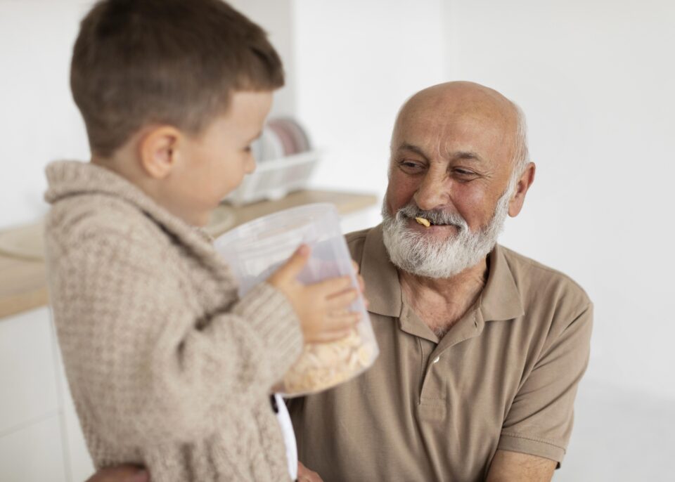
Tommaso
63 years old – Grandfather
Tommaso is retired and enjoys spending time with his three grandchildren. He often welcomes them with candy and familiar sweets from trusted brands such as HARIBO.
He is looking for classic flavors and assorted packages through an e-commerce experience that is intuitive and easy to use.
Primary need: Navigate and purchase products confidently.
User journey insights
The user journey highlighted four main pain points and related design opportunities.
 User Journey di Fatima sul sito attuale: Fatima abbandona il sito perchè non può acquistare online le confezioni monoporzione da condividere con le sua amiche.
 User Journey di Paolo sul sito attuale: Paolo abbandona il sito frustrato, il sito mostra solo promozioni scadute in negozio, inoltre non permette l’acquisto online.
 User Journey di Greta sul sito attuale: Greta abbandona il sito delusa, ha fretta di acquistare delle caramelle ma il sito non ha un’e-commerce.
 User Journey di Tommaso sul sito attuale: Tommaso abbandona il sito perchè non ha la possibilità di acquistare online la confezione mista per i suoi nipoti.
1. No online purchasing option
Pain point
Users could not purchase HARIBO products directly through the website.
Opportunity
Introduce a complete e-commerce experience with:
- A visible shopping cart.
- Clear calls to action.
- Simple product discovery.
- Straightforward delivery options.
- A frictionless checkout flow.
2. Unclear navigation labels
Pain point
Some menu labels did not clearly communicate what users could do on each page.
Opportunity
Rename navigation items using clear, action-oriented language. For example, replace “HARIBO Shops” with “Shop” or “Buy”, depending on the market and content strategy.
Promotional content should also receive greater visibility within the primary navigation and homepage structure.
3. Overwhelming product page
Pain point
The existing product page appeared visually crowded and was difficult to browse efficiently.
Opportunity
Improve product discovery through:
- Clearer content hierarchy.
- More focused product cards.
- Filtering and categorization.
- Consistent product information.
- Direct integration with the e-commerce experience.
4. Outdated promotions
Pain point
The promotions section displayed offers that were no longer active.
Opportunity
Archive expired promotions and introduce a clearly labeled “Active Promotions” section on the homepage.
This would improve content accuracy, user trust and promotional visibility.
04. New Site Map

05. Design
Responsive product experience
The prototype was designed in both desktop and mobile versions.


06. User testing
The mobile experience was selected for usability testing because it provided a more demanding context for evaluating navigation. Unlike desktop interfaces, mobile devices do not offer hover states to help users understand which elements are interactive.
Testing approach
The mobile prototype was tested with five participants.
The goal was to understand whether users could:
- Navigate the hamburger menu.
- Identify interactive product cards.
- Access product details.
- Understand promotional content.
- Complete a purchase flow without assistance.
Findings
The five participants were able to navigate the website and complete an order without major difficulties.
However, the sessions revealed three areas that required further refinement:
- Some participants had difficulty understanding how to open product detail pages.
- Product cards did not always appear sufficiently interactive.
- The same promotional visual appeared in two different sections, causing confusion about the user’s current location within the website.
These findings showed that the core flow was understandable, but certain interaction cues and navigational signals needed to be made more explicit.
Design iterations
Based on the test results, I proposed the following improvements:
- Make product access explicit: Add a clearly visible button or link to open the product detail page. This is especially important on mobile, where hover interactions are unavailable.
- Strengthen breadcrumb visibility: Increase the breadcrumb’s contrast and size to help users understand where they are within the website structure.
- Differentiate promotional sections: Use distinct visual treatments and labels for promotional content on the homepage and in the shop. This reduces ambiguity and improves orientation.

Outcome
The redesign combines a refreshed visual identity with a clearer, more commerce-oriented website experience.
The proposed solution addresses the main issues identified during the research phase:
- It modernizes HARIBO’s visual language without losing brand recognition.
- It simplifies navigation and improves information hierarchy.
- It introduces a clear path toward online purchasing.
- It supports product discovery through better categorization and filtering.
- It considers accessibility and responsive behavior.
- It validates key interactions through mobile usability testing.
The project demonstrates how a familiar consumer brand can evolve its digital experience by connecting brand strategy, user needs and business opportunities.

