

AI-Assisted Onboarding for a Carpooling App
I redesigned the onboarding experience of a carpooling application by replacing a long, static setup flow with a guided conversation powered by an AI assistant.
The goal was to help new users configure their first recurring commute in less than two minutes and reach their first reliable ride match with less friction.
Rather than asking users to complete a long form, the AI assistant guides them through a sequence of contextual questions. It collects only the information needed at each stage, confirms user input in real time and adapts the conversation according to the user’s role, destination and travel preferences.
Year: 2026
Title: AI-Assisted Onboarding for a Carpooling App
Client: JoJob
Role: UX/UI Designer & Graphic Designer
Type: AI-assisted mobile onboarding
Tools: Figma, ChatGPT, Visily, Lovable, Stitch, Perplexity and Accessibility Simulator.

The challenge
The existing onboarding flow relied on multiple static screens and forms. Users had to move through a linear sequence while providing information that was not always necessary to reach the product’s core value.
This created several issues:
- The onboarding experience was fragmented across too many screens.
- The initial explanation contained a high amount of text.
- Some profile fields were not essential at the beginning of the journey.
- The user was asked to name a trip before defining its actual details.
- The role selection included dense explanatory text.
- Community information was requested before users could see a potential match.
- The flow did not adapt sufficiently to the user’s intent.
The main challenge was therefore to transform onboarding from a passive data-collection process into a clear, contextual and engaging experience.
Project goals
The redesign focused on four objectives:
- Reduce the cognitive load associated with onboarding.
- Help users configure a recurring commute quickly.
- Personalize the experience according to the user’s role and needs.
- Bring users to their first relevant ride match as soon as possible.
The wider product goal was to improve activation by making the value of the service visible during the first interaction.
01. As-is analysis
Initial entry point
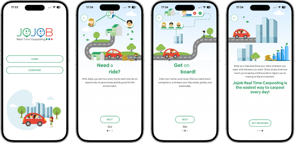
When opening the application, users were presented with two options: Log in and Sign up.
Both actions had a similar visual hierarchy, which made it difficult for new users to understand the intended next step.
After selecting Sign up, users were shown three static product introduction screens.
Strengths
- A skip option gave users control over the introduction.
- Pagination dots communicated progress.
- The structure was familiar and easy to understand.
Opportunities
- The screens contained too much text.
- The value of the product was not communicated quickly enough.
- The static presentation did not adapt to the user’s context.
- The onboarding experience did not fully follow a minimal and focused approach.
Profile setup

The next stage required users to complete a static profile form.
Some fields, such as gender, birthday and nationality, were not essential for the core onboarding goal. Asking for these details too early increased the perceived effort and delayed the first meaningful interaction with the service.
Design opportunity
Collect only the information required to configure the first journey. Additional profile details can be requested later, once the user has understood the product’s value.
First trip configuration

The existing flow asked users to name the trip before defining the departure and destination points.
This created a mismatch between the system’s logic and the user’s mental model. Naming a trip is more meaningful after the journey has already been configured.
Design opportunity
First define the route, schedule and role. Then allow users to confirm or name the journey as a final step.
Role selection
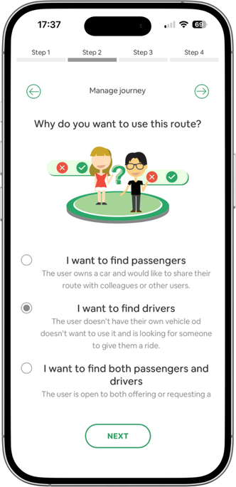
Users could choose whether they wanted to offer a ride, request a ride or do both.
The logic was clear, but the screen contained a dense amount of explanatory text.
Design opportunity
Use shorter descriptions, visual cues and contextual help to make the available roles easier to understand at a glance.
Destination and return journey


The existing flow combined assisted text input with an interactive map. This was a strong pattern because it allowed users to verify the location visually and reduced the risk of entering an incorrect address.
However, the naming of the return journey was introduced before the main journey details had been fully confirmed.
Design opportunity
Keep the map and autocomplete interaction, but move naming and optional customization after the route has been validated.
Value proposition and community code


The application communicated its environmental impact through metrics such as CO₂ savings and the equivalent number of trees planted.
This helped connect the individual action with a broader collective benefit.
However, the community code was requested before users could see their first match. This introduced an administrative step at a moment when users were primarily interested in seeing the result of their configuration.
Design opportunity
Show the first relevant match before asking for optional community information.
02. The proposed approach
Why a conversational AI assistant?
The analysis showed that the primary issue was not simply the number of fields. The deeper problem was that the onboarding experience did not adapt to the user’s context.
A conversational assistant offered an opportunity to:
- Ask one question at a time.
- Reduce the visual and cognitive load of the interface.
- Adapt the flow according to the user’s answers.
- Avoid irrelevant questions.
- Confirm information immediately.
- Guide users toward their first match.
The user is no longer asked to complete a form. Instead, they build their commuting routine through a guided interaction.
Conversational design principles
The proposed assistant follows five principles:
- Transparency. The assistant clearly identifies itself as an AI assistant from the beginning of the interaction.
- Progressive disclosure. The system requests information gradually instead of presenting all fields at once.
- Contextual adaptation. The conversation changes according to the user’s role, destination, schedule and preferences.
- Immediate confirmation. The assistant confirms relevant inputs in real time, reducing uncertainty and errors.
- Human and reliable communication. The tone is friendly and approachable while remaining precise and trustworthy, especially when handling addresses, schedules and personal data.
03. Mobile onboarding flow
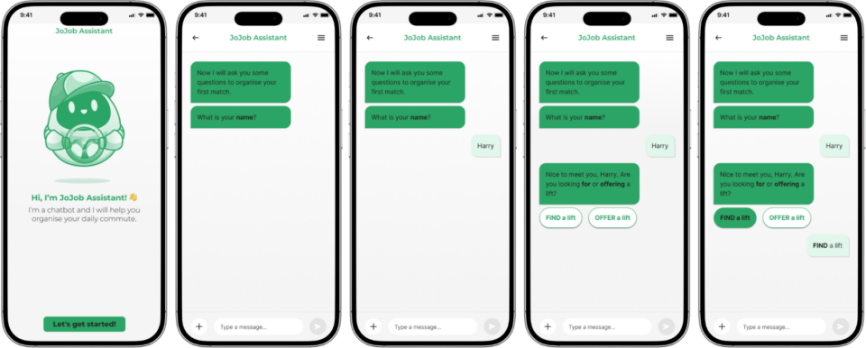
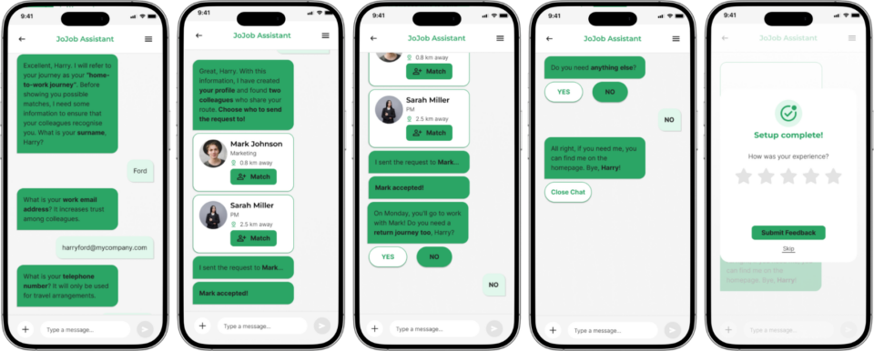
1. Introduction and personalization
When users open the application, the AI assistant welcomes them and explains its role.
The assistant asks for the user’s name to make the interaction feel more personal from the beginning.
The first question identifies the user’s main intention:
Are you looking for a ride or would you like to offer one?
This allows the system to identify whether the user is a passenger, a driver or both, and adapt the following steps accordingly.
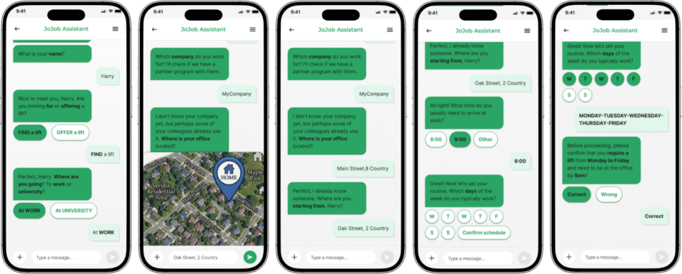
2. Defining the destination
The assistant asks where the user is travelling, such as an office or university.
If the user selects Office, they can enter the company name and address. The location is displayed on a map while the user types, providing immediate visual confirmation.
This combination of assisted text input and map feedback helps prevent address errors and connects the user’s intention with a real location.
3. Planning the commute
The assistant asks when the user needs to arrive and which days they usually travel.
Quick replies support fast selections, while users can still enter a different time when the available options do not match their routine.
This interaction pattern keeps the process efficient without making the user feel restricted.
4. Defining the starting point
The assistant then asks for the user’s departure address.
As with the destination, the address is shown on the map during entry. This maintains consistency and makes the location-based interaction easier to understand.
5. Creating the profile
Before showing possible matches, the assistant asks for essential profile details, such as:
- Last name.
- Email address.
- Phone number.
These details support trust, safety and communication between people who share a commute.
The redesigned flow prioritizes information that is necessary for a reliable matching experience while avoiding unnecessary profile questions during the first interaction.
6. Selecting a driver
Once the journey details have been configured, the system displays a list of compatible drivers.
The results prioritize people with similar routes or nearby starting points. Each result includes relevant information such as:
- Profile photo.
- Name.
- Role.
- Distance from the user’s home.
- Route compatibility.
The user can select a preferred driver and request a ride.
7. Confirming the journey
After the selected colleague accepts the request, the ride is confirmed.
The assistant then offers the option to add a return journey. Because this action is optional, the user is not forced through an additional step when it is not relevant.
The onboarding ends with the journey configured and the user ready to use the service.
04. Experience improvements
Personalization
The assistant addresses the user by name and adapts the flow according to:
- Driver or passenger role.
- Destination type.
- Arrival time.
- Travel days.
- Route preferences.
This creates a more relevant experience than a fixed sequence of screens.
Reduced complexity
The onboarding is divided into small, manageable steps.
Quick replies accelerate common decisions, while conversational prompts replace a dense form and reduce the perceived effort of profile setup.
Natural guidance
The chat-based interaction allows the assistant to provide explanations and suggestions within the context of the user’s current decision.
This makes the experience more approachable, especially for users who may find traditional forms overwhelming.
Faster activation
By focusing on the first recurring journey and delaying non-essential information, the flow aims to help users reach their first relevant match sooner.
The original project hypothesis estimated that a conversational experience could reduce onboarding drop-off by approximately 20–50% and increase profile completion by approximately 30–40%. These figures should be presented as design hypotheses, not measured outcomes, unless they are later validated through product analytics or user testing.
05. AI-assisted design workflow
AI was used as an extension of the design process, not as a replacement for design judgment.
I used different tools for different stages, from strategic exploration and user-flow development to visual prototyping, accessibility review and file organization.
The final decisions remained under my direction throughout the project.
ChatGPT: Strategic brainstorming
ChatGPT acted as a creative and analytical partner during the early stages. I used it to:
- Explore alternative onboarding models.
- Challenge initial assumptions.
- Identify friction points in the existing flow.
- Refine the interaction logic.
- Consider different conversational patterns.
This helped me evaluate the transition from a static form to a guided conversation before moving into detailed interface design.
Visily: User-flow visualization
Visily was used to translate the initial concepts into a structured flow.
The first AI-generated output served as a starting point. I manually refined the flow to:
- Remove unnecessary steps.
- Improve the sequence of questions.
- Align the logic with the onboarding objective.
- Ensure that the user could reach a first match efficiently.
Lovable: Rapid visual exploration
Lovable was used to generate early visual alternatives for the key views. Through prompt iteration, I explored:
- Layout variations.
- Component structures.
- Conversational UI patterns.
- Different ways to present quick replies and journey information.
The tool supported rapid exploration, while the final interface decisions were evaluated against usability and product requirements.
Stitch: Style exploration and iteration
Stitch was used to generate additional visual directions and challenge the initial style decisions. Some outputs diverged from the intended direction, but this was still useful because the alternatives created opportunities to reassess:
- Visual hierarchy.
- Component proportions.
- Layout composition.
- The balance between conversational content and functional controls.
Accessibility Simulator: Inclusive design review
The Accessibility Simulator plugin in Figma was used to simulate different visual impairments. This allowed me to review:
- Contrast and legibility.
- Visual hierarchy.
- The clarity of interface controls.
- The accessibility of key interaction states.
The purpose was to identify potential barriers before presenting the final design.
Perplexity: File organization
Perplexity supported the technical organization of the Figma file. I used it to plan:
- Layer naming conventions.
- File hierarchy.
- Component organization.
- More consistent structure across the design deliverables.
This helped reduce repetitive work and produce a cleaner, more professional handoff file.
06. The role of AI in the process
Critical thinking and validation
Using ChatGPT as a senior design discussion partner allowed me to challenge my assumptions before investing time in visual execution.
The AI helped me examine whether each step was necessary and whether the transition from form-based onboarding to conversational onboarding was logically coherent.
Creative exploration
Tools such as Lovable and Stitch generated alternative visual interpretations of the same requirements.
These outputs were not treated as final solutions. Instead, they were used as prompts for comparison, evaluation and creative exploration.
Efficiency and focus
AI reduced the time spent on repetitive or exploratory tasks, such as:
- Generating early flow alternatives.
- Producing visual directions.
- Organizing Figma layers.
- Simulating accessibility conditions.
- Structuring design documentation.
This freed more time for higher-value activities, including experience strategy, interaction logic and critical evaluation.
Human-led decision-making
AI generated suggestions, but I evaluated every output against:
- User needs.
- Product goals.
- Interaction clarity.
- Accessibility.
- Technical feasibility.
- Consistency across the experience.
The final design was therefore not generated by AI alone. It was shaped through a continuous cycle of prompting, comparison, critique, refinement and human decision-making.
Outcome
The project transformed a fragmented onboarding flow into a guided conversational experience. The proposed solution:
- Replaces a long static form with progressive interaction.
- Adapts the experience to the user’s role and commuting needs.
- Reduces unnecessary information requests.
- Uses quick replies to simplify common decisions.
- Combines conversational input with map-based validation.
- Brings users closer to their first relevant match.
- Delays optional administrative steps until they become contextually relevant.
- Integrates AI into the design workflow while preserving human control.

