

FlowManager
Flow Manager is a management software concept designed for Project Managers who need to monitor projects, resources, deadlines, budgets and team workloads from a single platform.
The project was commissioned by Flow Consulting with the goal of creating a clear and efficient tool for managing multiple projects simultaneously.
The interface combines interactive dashboards, detailed project and team views, timesheets and expense tracking, with a strong focus on information hierarchy, usability and accessibility.
Year: 2025
Title: FlowManager
Client: Flow Consulting
Role: UX/UI Designer
Type: Management software
Tools: FigJam; Miro; Figma.
Project goals
Project Managers often need to monitor multiple projects, teams and deadlines at the same time. The challenge was to design a management platform that could provide a quick overview of project health while still giving access to detailed information when needed.
The product needed to help users:
The design goal was therefore to balance information density with clarity and ease of use.
01. Branding
Creating the visual identity
The visual identity was designed to communicate trust, professionalism and dynamism.
The Flow Manager logo represent a wave, symbolising workflow, change and movement. Its shape also follows an “M” structure, creating a visual connection with the word Manager.
The
Color palette
Blue was selected as the primary brand color to communicate trust, stability and professionalism.
#030A8C
Phthalo Blue
#0D04F1
Blue
Typography
A bold typography style was used to create a clear visual hierarchy and improve content scanning.
Poppins
sans-serif typeface
Bold weight
02. Discovery
Requirements
During the discovery phase, the main product requirements were identified.
Flow Consulting needed:
- An intuitive dashboard for monitoring projects and receiving immediate alerts;
- Team and workload management;
- Timesheet and budget tracking;
- A modent and reliable visual identity;
- Clear access to detailed project information.
The product was intended primarily for desktop use in an office environment, where Project Managers would work with the system throughout their working day.
Accessibility audit

Accessibility was considered throughout the visual design process.
- Accessible colour contrast. The colour system combines the primary blue palette with green, orange and red status colours. Contrast was carefully considered to ensure that text, alerts and status indicators remained readable.
- Clear visual hierarchy. Headings, labels, status indicators and content sections were structured to make information easy to scan and understand.
- Icons + text. Navigation items and buttons combine icons with text, supporting faster recognition and reducing ambiguity.
- Clear and consistent layouts. Spacing, alignment and grid systems were used to create a structured interface that allows users to process complex information quickly.
03. Define
Target
The product is designed for Project Managers working in:
- Creative agencies;
- IT consulting companies;
- Technology startups.
Although their working environments differ, they share a common need: having a clear overview of projects, people, deadlines and resources in one place.
User personas

Charlotte
40 years old – PM in creative agency
Charlotte manages multiple short-term projects involving designers and developers.
Needs:
- Keep deadlines under control;
- Quickly identify delayed projects;
- Monitor several projects from a single dashboard;
- Coordinate multidisciplinary teams.
Key touchpoints: Dashboard, Project List

David
43 years old – PM in IT Consulting Company
David supervises complex projects for corporate clients.
Needs:
- Monitor project budgets;
- Understand team workload;
- Track project progress;
- Access detailed project information;
- Keep track of working hours.
Key touchpoints: Project Details, Dashboard, Timesheet

Martina
25 years old – Junior PM in Tech startup
Martina works on a smaller number of highly dynamic projects.
Needs:
- Quickly communicate with the team;
- Coordinate people and skills;
- Adapt to constantly changing project requirements;
- Use simple and efficient tools.
Key touchpoint: Team Management
User journey
At this stage, the focus was on Charlotte, the primary buyer persona, to understand her needs, behaviours and challenges throughout her interaction with Flow Manager.
The user journey was mapped to understand how Charlotte moves between high-level project monitoring and more detailed management tasks, identifying key needs, pain points and opportunities for improvement.

Pain Points & Opportunities
The user journey highlighted four key pain points in Charlotte’s experience, revealing opportunities to make project management more efficient, focused and predictable.
1. Limited project overview
Pain point
Charlotte needs to monitor several projects simultaneously, but scattered information makes it difficult to get a quick overview of overall project status.
Create a centralized dashboard that provides an immediate overview of:
- Project status and progress
- Upcoming deadlines
- Critical alerts and delays
- Team workload
This allows Charlotte to identify priorities without having to navigate through multiple sections.
2. Difficulty identifying priorities
Pain point
When managing multiple projects, Charlotte needs to quickly understand which tasks or projects require her attention. Without clear visual cues, important issues can easily be overlooked.
Opportunity
Introduce a clear visual hierarchy and priority system using:
- Status indicators
- Alerts and notifications
- Priority labels
- Progress indicators
- Clearly highlighted deadlines
This would help Charlotte focus on the most critical issues first.
3. Fragmented team management
Pain point
Coordinating designers and developers across different projects requires Charlotte to constantly keep track of availability, workload and responsibilities.
Opportunity
Provide a dedicated team management area where Charlotte can quickly:
- View team members and roles
- Monitor workload
- Check availability
- Identify resource conflicts
- Understand who is assigned to each project
This would make resource allocation faster and more informed.
4. Lack of detailed project visibility
Pain point
While an overview is essential, Charlotte also needs to access detailed project information when investigating delays, monitoring progress or making decisions.
Opportunity
Create a structured project detail view that allows her to move seamlessly from the overview to deeper information, including:
- Project progress;
- Deadlines and milestones;
- Team members;
- Working hours;
- Budget and expenses.
This creates a clear “overview → investigate → act” workflow, reducing unnecessary navigation and supporting faster decision-making.
04. Ideate
User Flow
The user flow was designed to minimise unnecessary navigation and make the most important information accessible from the dashboard.
The structure allows users to move between:
Dashboard → Projects → Project Details → Team Management → Timesheet
This creates a connected workflow between project monitoring, resource management and time tracking.

05. Design
Wireframe
Low-fidelity wireframes were created to define the structure and hierarchy of the main screens before moving into the visual design phase.
The main screens include:
- Login
- Dashboard
- Project Details
- Timesheet
The product was designed exclusively for desktop, reflecting its intended use within an office environment during working hours.


Prototype
The final prototype brings together the main workflows and management features of the platform.
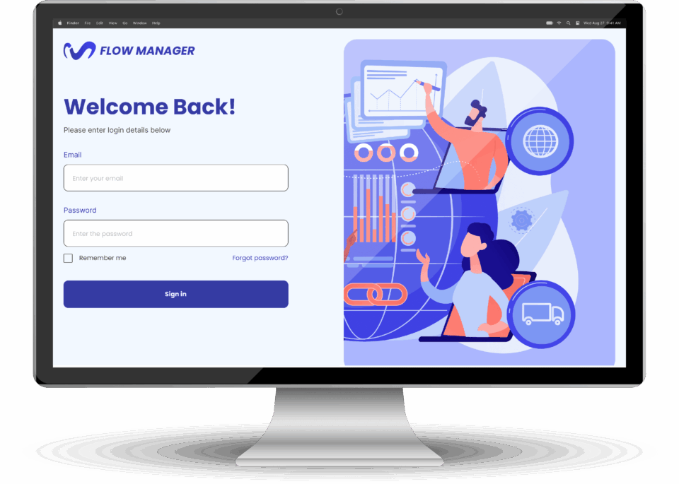
- Login. A simple entry point designed to provide quick and frictionless access to the platform.
- Dashboard. The central workspace provides a high-level overview of projects, deadlines, alerts and team activity.
- Team Management. A dedicated space for monitoring team members, workload and skills.
- Projects. A structured view of active projects, making it easier to monitor progress and identify projects that require attention.
- Project Details. A detailed view containing the information needed to understand the status and progress of an individual project.
- Timesheet. A dedicated section for tracking working hours and supporting project monitoring and budget management.


06. conclusions
Flow Manager was designed as a scalable and versatile desktop management platform, combining complex functionality with a clear and intuitive user experience.
The main design challenge was to present a large amount of information without overwhelming the user. The solution was to build a strong information hierarchy, supported by dashboards, structured layouts, consistent navigation and clear visual indicators.
Accessibility and inclusivity were also considered throughout the design process, particularly in relation to colour contrast, readability, visual hierarchy and the use of icons alongside text.
The final result is a complete, professional prototype demonstrating skills in:
- UX/UI Design
- Dashboard Design
- Information Architecture
- Complex Data & Information Hierarchy
- User-Centred Design
- Accessibility
- Visual & Brand Design
- Prototyping in Figma
Flow Manager demonstrates how complex business requirements can be transformed into a clear, efficient and accessible digital product.

